Shipping Containers with a Conceptual Mark
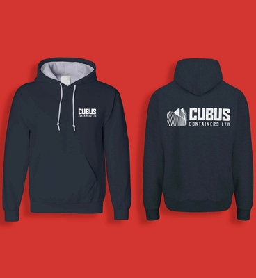
A bold and abstract logo design created for Cubus Containers, a new freight shipping container supplier based in North Devon.
The
Brief
'Cubus Containers' is a freight container trading company based in North Devon, looking for their own, unique and bold identity.
The brief was to 'be bold' and demonstrate a competent, confident and efficient company with a striking logo design distinct from their parent company.
Whilst open to alternative ideas, the team at Cubus Containers envisaged a contemporary logo design with a minimal style, simple shapes and a calm color scheme that represented the company's association with shipping, predominantly shades of blue and grey alongside bright or contrasting accent colours.


The
Final Design
The abstract monogram design created for concept 03 was chosen for the final logo design. To enhance the brand's style and make it more eye-catching, slight changes were made to the color palette. Adding vivid blues and a lively sun yellow into the palette gives the brand a greater versatility and the striking look they were aiming for.


Pie listens to feedback and always comes up with excellent designs, making it hard to choose! Pie understands the business and brand and delivers in a timely manner.
Love Pie's designs and creativity and we look forward to working with her again in the future. Would highly recommend!
Laura Trevillian | 2024


