A Sock Seller's Vibrant and Whimsical Re-brand
A playful, illustrated logo design with a classic brand colour palette created for an established sock retailer looking for a brand identity overhaul.
The
Brief
Sock Solutions was founded in 2005 and recently acquired by new owners in 2021 with the goal of revitalising the brand and introducing a fresh identity.
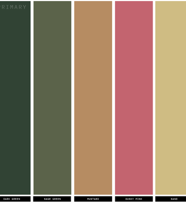
The Devon based family-owned company offer a wide selection of premium socks for men, women and children which prompted the need for a logo that strikes a balance between classic and fun. The core colour scheme should reflect the business's key principles of tradition, sophistication, quality and longevity, whilst the secondary colours could create a more friendly, welcoming and inclusive atmosphere and provide plenty of flexibility when designing their unique brand materials.


The
Final Design
The final logo chosen was Concept No. 02, which had a small tweak to the 'openness' of the sock-shaped 'S'. The word-mark sizing and coloring were simplified, and the terracotta shade in the secondary color palette was changed to a warmer, 'fuchsia' pink. The vibrant and playful color scheme perfectly captured the intended blend of tradition and innovation.


Love, love, love Pie's designs. She's created the branding for two businesses for us now and her ideas and design skills are amazing. If you're looking for a creative and imaginative designer for your business, look no further!
Katie Lassam | 2021


